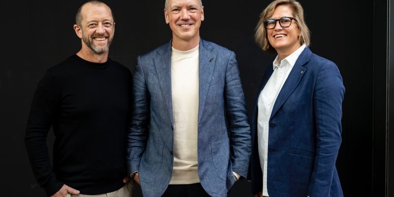
When Sequana co-founders Mike Walsh and Frank Fisseler started the business in late-2019, creating a brand was the last thing on the mind of the seasoned engineer and lawyer.
They simply wanted to get stuck in and continue to deliver the extraordinary results they were both renowned for.
They had no idea what was in store for them when they came up with the name ‘Sequana’ over a fire pit when they were brainstorming about how their new business venture was going to do things differently and be centred on people, culture and community.
‘Sequana’ means goddess of the river Seine, and with its link to water, reflects Mike and Frank’s passion for art, history and culture, adding their signature quirky touch to the water industry.
Only a few short years later, and despite focusing on outputs rather than marketing and branding, the business has flourished. It was their philosophy centred on ambition, resilience, camaraderie, and an unceasing desire to push beyond limits, achieving seemingly insurmountable goals that have been significant drivers behind Sequana’s rapid growth.
Growing from a team of two to a workforce of over 70 full-time staff and 300+ contractors, with ongoing growth, has been a significant evolution for Sequana. Engaged in major infrastructure projects in Australia’s water, energy, and environment sectors, 2024 marked a collective aspiration for Sequana to undergo a transformative ‘glow-up’. This evolution is not just well-deserved but also a true reflection of who we are today. As an independent business, we are privileged with the freedom and innovative mindset to take a unique approach and infuse creativity into our brand to make a lasting impression on our clients and industry peers. The process of redefining our brand identity was not just a task; it was a journey filled with excitement and enthusiasm and included:
Logo
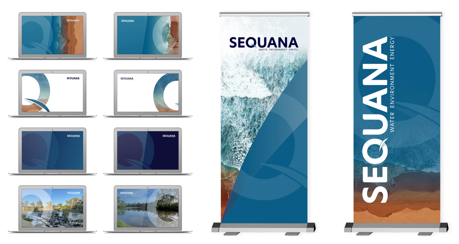
The introduction of a refreshed logo which was an evolution of the previous version to strengthen it whilst taking into consideration team feedback on the elements they liked and wanted to retain. We also ditched the ‘Partners’ as we are more than just the Managing Partners who started Sequana. They still steer the ship, but we have a whole crew that make Sequana the business it is today and will be in the future.

Hero Brand Elements
You will see a stunning beach image pop up in a lot of our new branding assets, heroing the stunning Bilgola Beach in NSW by photographer Will Turner. The iconically Australian photo brings our evolved brand colours to life visually, features water, and of course, the ocean ties to desalination, an area we specialise in.

We also introduced another brand element, the Sequana ‘Q.’
The ‘Q’ was identified by one of our longstanding team members, as a great identifiable symbol. With the water flick over the ‘Q’ it nods to the industry we operate in and has become something we can use on its own and incorporate into our images, templates and other visuals to give them a ‘Sequana’ flavour.
Not only do we love the visual element of this, but we also love what it stands for. The ‘Q’ represents ‘Quality’ and ‘Questioning’, two elements that Sequana is known for. We don’t just say yes. We analyse, we challenge and we ask the right questions to get the best outcomes and solutions for our clients, always delivering the highest quality of outputs and outcomes.
Website
Our new website (we hope you are enjoying looking around!) brings our new brand to life and represents the sophistication and size of Sequana today with new content and pages to provide a deeper look into who we are, what we do, what we stand for and what we have to say. This has ensured that the website not only reflects what we do as a business but also our values, mission and culture, which are equally as important to who we are.
As a rapidly growing business, we will continue to evolve and innovate and are excited about what the next chapter holds for Sequana. Watch this space!

By Zoe Walsh, National Director – Marketing, Communications & Engagement
